Correlation and Covariance
Overview
Teaching: 60 min
Exercises: 30 minQuestions
Investigate data with continuous response and continuous predictor variables.
Covariance and Correlation Coefficient
In the previous section we looked at the relationship between a continuous response variable and one or more categorical predictors.
We are interested in studying the relationship between a continuous response variable $Y$ and a single continuous predictor $X$.The covariance between $Y$ and $X$ measures the direction of the linear relationship between $Y$ and $X$ but tells us nothing about the strength of the relationship since it changes if we change the unit of measurement. If $Cov(Y,X)>0$ then there is a positive relationship between $Y$ and $X$ but if $Cov(Y,X)<0$ the relationship is negative.
The correlation coefficient between $Y$ and $X$ is scale invariant so it measures both the direction and strength of the linear relationship between $Y$ and $X$.
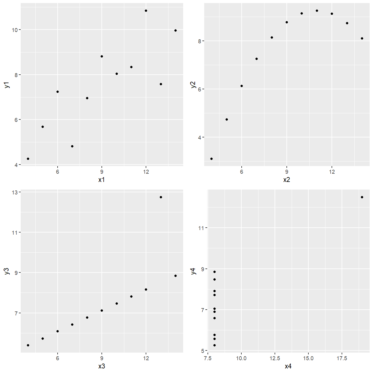
EXAMPLE: Anscomb (1973) used four data sets to illustrate the importance of investigating the data using scatter plots and not relying totally on the correlation coefficient. The four data sets are given below. Explore the data graphically and obtain the correlation coefficient for each data set. ($r^2=\frac{\sum(x_i-\bar{x})(y_i-\bar{y})}{\sum(x_i-\bar{x})^2\sum(y_i-\bar{y})^2)}$)
The file Anscombe.csv contains this data.
library(tidyverse)
library(readr)
library(ggpubr)

anscomb <- read_csv(file.path("..", "data", "Anscomb.csv"))
anscomb
# A tibble: 11 x 8
      x1    y1    x2    y2    x3    y3    x4    y4
   <dbl> <dbl> <dbl> <dbl> <dbl> <dbl> <dbl> <dbl>
 1    10  8.04    10  9.14    10  7.46     8  6.58
 2     8  6.95     8  8.14     8  6.77     8  5.76
 3    13  7.58    13  8.74    13 12.7      8  7.71
 4     9  8.81     9  8.77     9  7.11     8  8.84
 5    11  8.33    11  9.26    11  7.81     8  8.47
 6    14  9.96    14  8.1     14  8.84     8  7.04
 7     6  7.24     6  6.13     6  6.08     8  5.25
 8     4  4.26     4  3.1      4  5.39    19 12.5
 9    12 10.8     12  9.13    12  8.15     8  5.56
10     7  4.82     7  7.26     7  6.42     8  7.91
11     5  5.68     5  4.74     5  5.73     8  6.89
| x1 | y1 | x2 | y2 | x3 | y3 | x4 | y4 |
|---|---|---|---|---|---|---|---|
| 10 | 8.04 | 10 | 9.14 | 10 | 7.46 | 8 | 6.58 |
| 8 | 6.95 | 8 | 8.14 | 8 | 6.77 | 8 | 5.76 |
| 13 | 7.58 | 13 | 8.74 | 13 | 12.74 | 8 | 7.71 |
| 9 | 8.81 | 9 | 8.77 | 9 | 7.11 | 8 | 8.84 |
| 11 | 8.33 | 11 | 9.26 | 11 | 7.81 | 8 | 8.47 |
| 14 | 9.96 | 14 | 8.10 | 14 | 8.84 | 8 | 7.04 |
| 6 | 7.24 | 6 | 6.13 | 6 | 6.08 | 8 | 5.25 |
| 4 | 4.26 | 4 | 3.10 | 4 | 5.39 | 19 | 12.50 |
| 12 | 10.84 | 12 | 9.13 | 12 | 8.15 | 8 | 5.56 |
| 7 | 4.82 | 7 | 7.26 | 7 | 6.42 | 8 | 7.91 |
| 5 | 5.68 | 5 | 4.74 | 5 | 5.73 | 8 | 6.89 |
Now we want to see what each data set looks like.
p1 <- ggplot(anscomb, aes(x = x1, y = y1)) + geom_point()
p2 <- ggplot(anscomb, aes(x = x2, y = y2)) + geom_point()
p3 <- ggplot(anscomb, aes(x = x3, y = y3)) + geom_point()
p4 <- ggplot(anscomb, aes(x = x4, y = y4)) + geom_point()

ggarrange(p1, p2, p3, p4, ncol = 2, nrow = 2)

Base R has the cor function to produce correlations and the cov function to produce
covariances. The default is Pearson’s correlation.
cor(anscomb$x1, anscomb$y1)
cor(anscomb$x2, anscomb$y2)
cor(anscomb$x3, anscomb$y3)
cor(anscomb$x4, anscomb$y4)
[1] 0.8164205
[1] 0.8162365
[1] 0.8162867
[1] 0.8165214
To two decimal places, all 4 sets of data have
0.82
correlation yet the plots don’t all look linear. Just because you have a high correlation is not
a sufficient reason to fit a straight line to the data. Even though Data Set 2 has high positive
correlation it is obvious from the plot of y2 vs x2 that a perfect nonlinear relationship
describes the relationship between the two variables better. Looking at the plot of y3 versus
x3 it is obvious if it wasn’t for the second last data point the relationship would be
perfectly linear with a positive slope. Look at the last plot, if it wasn’t for the point on its
own there would be no relationship between y4 and x4, such a point is called highly
influential because if it was removed the curve fitted would be very different. Only the plot of
y1 versus x1 could be considered to be approximately linear.
Key Points