Preparing and Investigating Data
Overview
Teaching: 60 min
Exercises: 30 minQuestions
What to do before you can bring the data into R?
Objectives
Identify different data types
Recognise different types of visualisations
First, we need to load the tidyverse package (actually a collection of packages).
library(tidyverse)
We can now load the Pattani data from the Excel file. For the notes, this is stored
in the data directory. It might be different for you.
path <- file.path("..", "data", "Pattani.xlsx")
pattani <- readxl::read_excel(path, sheet = "Data", skip = 1)
readxl::read_excel is used to explicitly call the read_excel function in the readxl
package.
We would like to see what the data looks like now that it has been read into R. You can just type the name of the dataset.
pattani
# A tibble: 434 x 8
      ID `blood lead`   age gender school   duration water `ln(blood lead)`
   <dbl>        <dbl> <dbl> <chr>  <chr>       <dbl> <chr>            <dbl>
 1     1         11.7    13 Boy    Tangkad~       13 Boil              2.46
 2     2         11.8    13 Boy    Tangkad~        5 Boil              2.47
 3     3          6.4    13 Girl   Tangkad~       13 Stand             1.86
 4     4          6.9    11 Girl   Tangkad~       11 Boil              1.93
 5     5         10.3    13 Girl   Tangkad~        5 Boil              2.33
 6     6          8.3    13 Girl   Tangkad~       13 Filt~             2.12
 7     7          6.2    13 Girl   Tangkad~        5 Filt~             1.82
 8     8          9.4    13 Boy    Tangkad~       13 Stand             2.24
 9     9         14.9    11 Boy    Tangkad~       11 Boil              2.70
10    10          8.1    11 Girl   Tangkad~       11 Filt~             2.09
# ... with 424 more rows
Read in the cuckoo data
Use the
read_csvfunction in thereadrpackage to loadcuckoo.csv.Solution
cuckoo <- readr::read_csv(file.path("..", "data", "cuckoo.csv"))
cuckoo
# A tibble: 45 x 2 Nest Length <chr> <dbl> 1 Robin 21.8 2 Robin 23.9 3 Robin 23 4 Robin 22.3 5 Robin 23.3 6 Robin 22 7 Robin 22.4 8 Robin 22.6 9 Robin 22.4 10 Robin 22 # ... with 35 more rows
Having names with spaces in them can make them more difficult to work with. We can add to the way that we read the file to modify the names.
pattani <- readxl::read_excel(path, sheet = "Data", skip = 1) %>%
  rename(blood_lead = `blood lead`, ln_blood_lead = `ln(blood lead)`)

pattani
# A tibble: 434 x 8
      ID blood_lead   age gender school     duration water  ln_blood_lead
   <dbl>      <dbl> <dbl> <chr>  <chr>         <dbl> <chr>          <dbl>
 1     1       11.7    13 Boy    Tangkadeng       13 Boil            2.46
 2     2       11.8    13 Boy    Tangkadeng        5 Boil            2.47
 3     3        6.4    13 Girl   Tangkadeng       13 Stand           1.86
 4     4        6.9    11 Girl   Tangkadeng       11 Boil            1.93
 5     5       10.3    13 Girl   Tangkadeng        5 Boil            2.33
 6     6        8.3    13 Girl   Tangkadeng       13 Filter          2.12
 7     7        6.2    13 Girl   Tangkadeng        5 Filter          1.82
 8     8        9.4    13 Boy    Tangkadeng       13 Stand           2.24
 9     9       14.9    11 Boy    Tangkadeng       11 Boil            2.70
10    10        8.1    11 Girl   Tangkadeng       11 Filter          2.09
# ... with 424 more rows
What does
%>%mean?
%>%is something from thetidyversecalled a pipe. It allows you to take the output from 1 function (in this caseread_excel) and put it directly into another function (rename). It is as though there is a pipe connecting the functions together.
Simple summary statistics
Previously we got a preview of the data, but we might want to get some summary statistics
about the columns. You can use the function summary for this.
summary(pattani)
       ID          blood_lead         age            gender
 Min.   :  1.0   Min.   : 4.00   Min.   : 5.000   Length:434
 1st Qu.:116.2   1st Qu.: 8.70   1st Qu.: 8.000   Class :character
 Median :231.5   Median :11.70   Median : 9.000   Mode  :character
 Mean   :229.5   Mean   :12.05   Mean   : 9.281
 3rd Qu.:344.8   3rd Qu.:14.70   3rd Qu.:11.000
 Max.   :454.0   Max.   :28.30   Max.   :13.000
                 NA's   :1
    school             duration         water           ln_blood_lead
 Length:434         Min.   : 2.000   Length:434         Min.   :1.386
 Class :character   1st Qu.: 5.000   Class :character   1st Qu.:2.163
 Mode  :character   Median : 8.000   Mode  :character   Median :2.460
                    Mean   : 7.922                      Mean   :2.425
                    3rd Qu.:10.000                      3rd Qu.:2.688
                    Max.   :13.000                      Max.   :3.343
                                                        NA's   :1
Have a look at the character columns. What sort of variables are these?
If we convert these to factor then R knows that they are categorical variables and does
some helpful things for us. We will use the as_factor function, which is part of the
tidyverse. There is also a base R function as.factor (note the . instead of _)
but we will use the tidyverse version.
pattani <- readxl::read_excel(path, sheet = "Data", skip = 1) %>%
  rename(blood_lead = `blood lead`, ln_blood_lead = `ln(blood lead)`) %>%
  mutate(gender = as_factor(gender), school = as_factor(school), water = as_factor(water))
What happens if we run the summary now?
summary(pattani)
       ID          blood_lead         age          gender
 Min.   :  1.0   Min.   : 4.00   Min.   : 5.000   Boy :204
 1st Qu.:116.2   1st Qu.: 8.70   1st Qu.: 8.000   Girl:230
 Median :231.5   Median :11.70   Median : 9.000
 Mean   :229.5   Mean   :12.05   Mean   : 9.281
 3rd Qu.:344.8   3rd Qu.:14.70   3rd Qu.:11.000
 Max.   :454.0   Max.   :28.30   Max.   :13.000
                 NA's   :1
        school       duration          water     ln_blood_lead
 Tangkadeng:136   Min.   : 2.000   Boil   :163   Min.   :1.386
 Thamthalu : 46   1st Qu.: 5.000   Stand  :163   1st Qu.:2.163
 Tachi     :128   Median : 8.000   Filter : 48   Median :2.460
 Tesabal 3 : 62   Mean   : 7.922   Nothing: 56   Mean   :2.425
 Sabarang  : 62   3rd Qu.:10.000   NA's   :  4   3rd Qu.:2.688
                  Max.   :13.000                 Max.   :3.343
                                                 NA's   :1
The factor variables now show the number of each element in the variables.
Convert cuckoo data to a factor
Convert the
Nestcolumn to a factor and display the summary.Solution
cuckoo <- readr::read_csv(file.path("..", "data", "cuckoo.csv")) %>%
  mutate(Nest = as_factor(Nest))
summary(cuckoo)
Nest Length Robin :16 Min. :19.80 Wren :15 1st Qu.:21.20 Sparrow:14 Median :22.30 Mean :22.24 3rd Qu.:23.00 Max. :25.00
Visualising the data
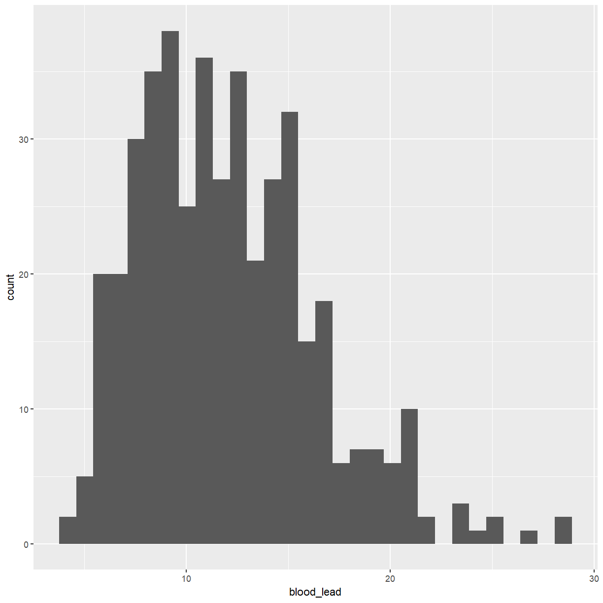
We will start with a histogram of the levels of lead in the blood.
ggplot(pattani, aes(x = blood_lead)) +
  geom_histogram()
I am not a fan of the grey background that is the default with ggplot graphs. You can
change that by adding a theme.
ggplot(pattani, aes(x = blood_lead)) +
  geom_histogram() +
  theme_bw()
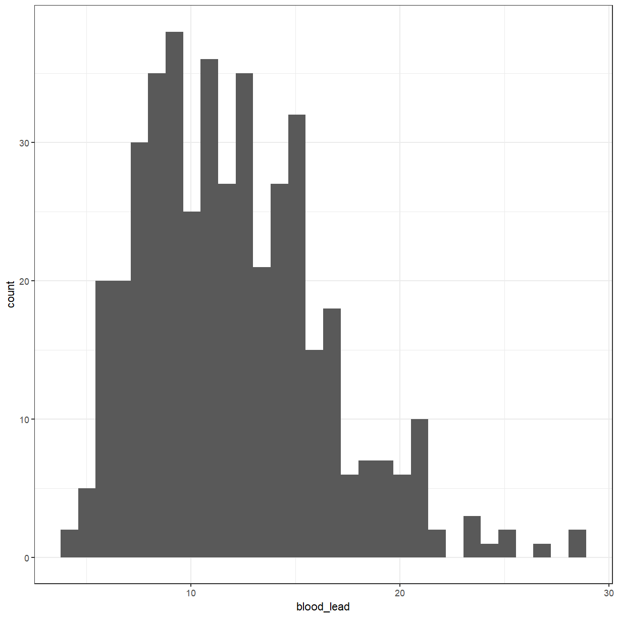
I will set the default theme so that I don’t have to specify it each time.
theme_set(theme_bw())
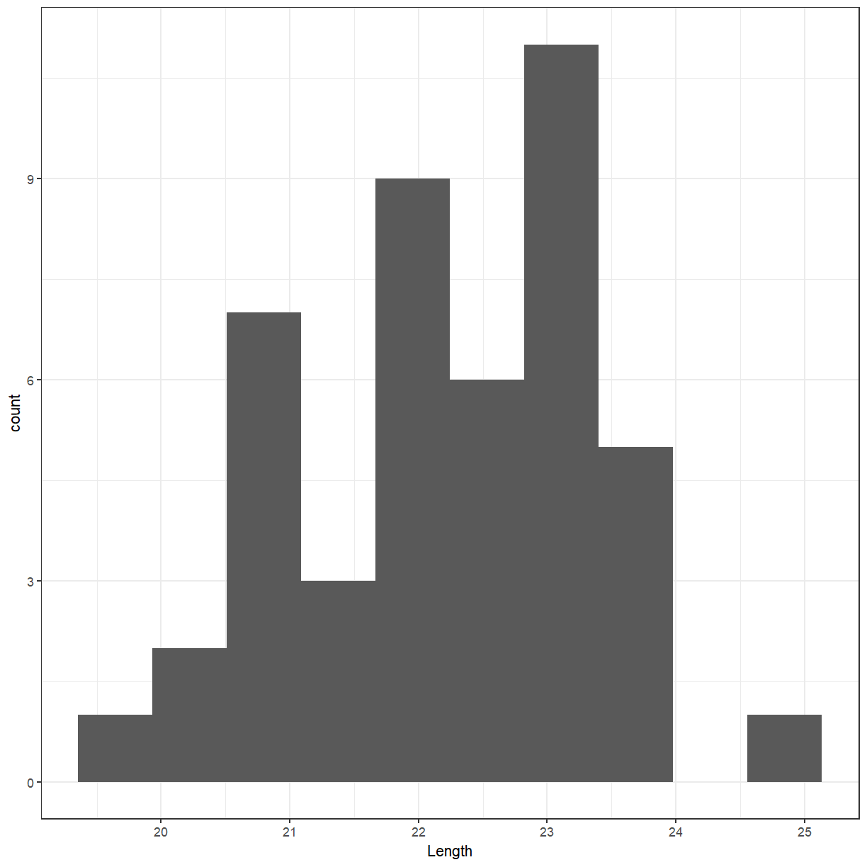
Create a histogram of the cuckoo egg lengths
Create a histogram of the cuckoo egg lengths
Solution
ggplot(cuckoo, aes(x = Length)) +
  geom_histogram(bins = 10)
Distribution?
- The distribution of a variable tells us what values it takes and how often it takes these values.
- When examining a distribution, look for shape, center, and spread and for clear deviations from the overall shape.
Moore, McCabe & Craig (2017)
You have probably heard of the Normal distribution, which has a bell shape.
ggplot(data = data.frame(x = c(-3, 3)), aes(x)) +
  stat_function(fun = dnorm, n = 101, args = list(mean = 0, sd = 1)) + ylab("") +
  scale_y_continuous(breaks = NULL)
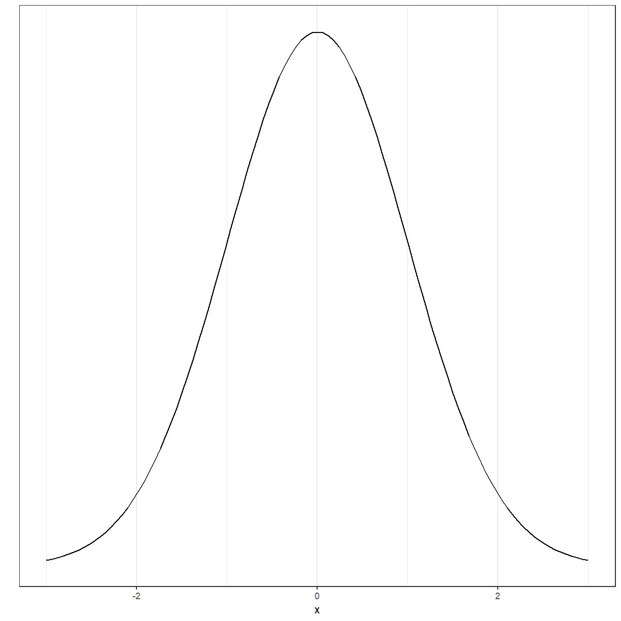
There are several other distributions. Several of the tests and models that we will discuss in this workshop have as one of the assumptions that either the data or the residuals of the model are Normally distributed.
Now back to what we were doing
For a lot of the statistical tests that we will be doing later, we would like the variable to be normally distributed. Looking at the histogram, it should be symmetric and bell-shaped.
ggplot(pattani, aes(x = ln_blood_lead)) +
  geom_histogram()
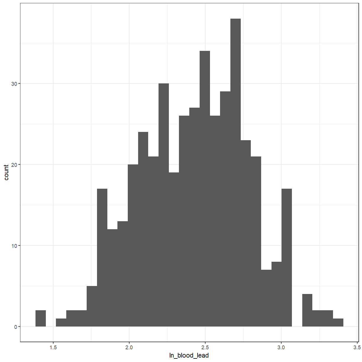
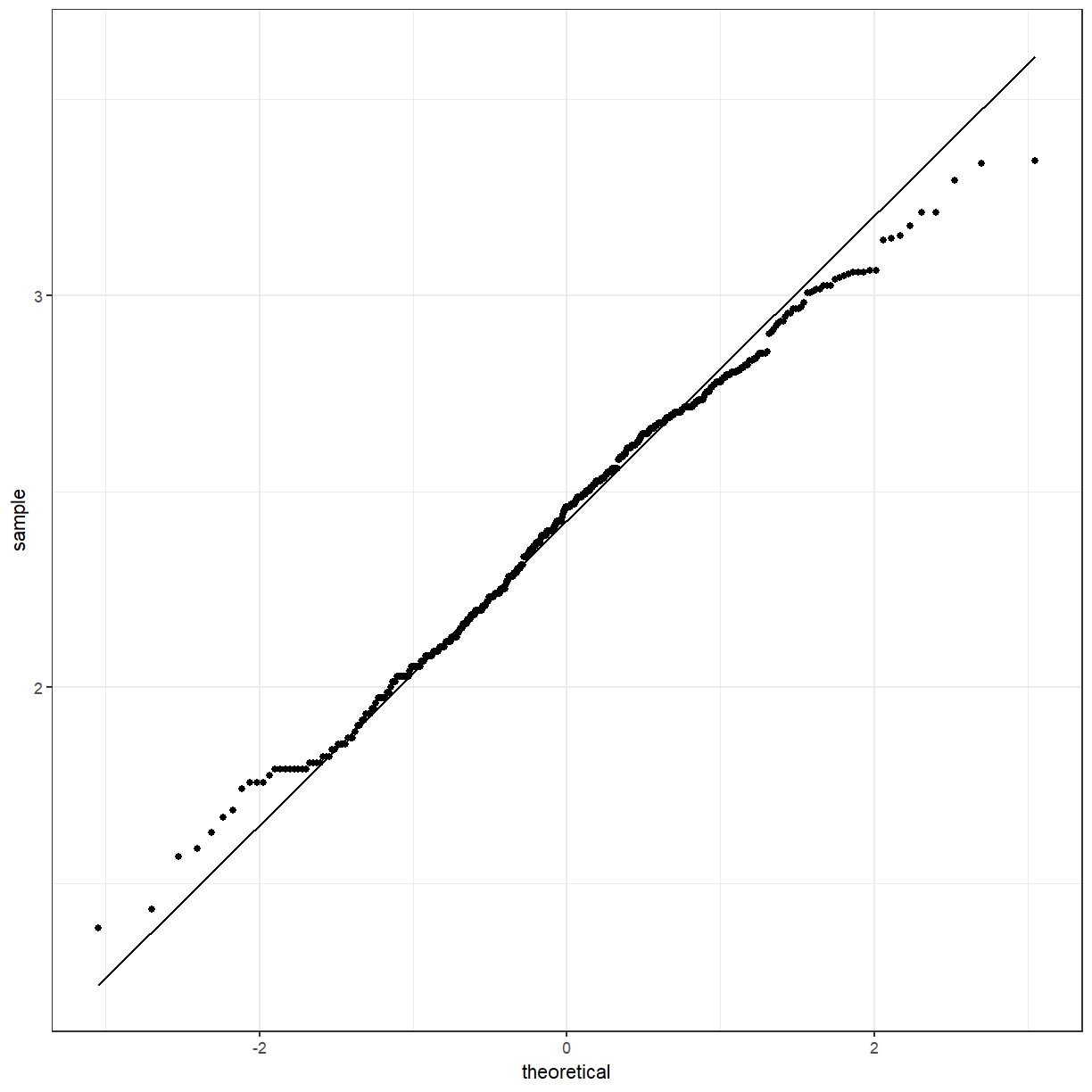
It looks a little bit better. We can also use a QQ-plot to check for normality. The points should lie approximately along the line.
ggplot(pattani, aes(sample = blood_lead)) +
  geom_qq() +
  geom_qq_line()
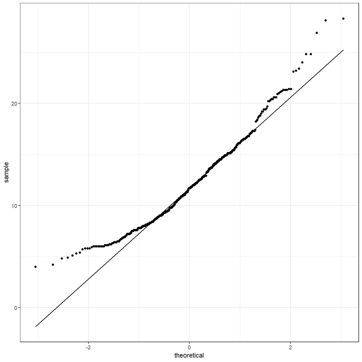
ggplot(pattani, aes(sample = ln_blood_lead)) +
  geom_qq() +
  geom_qq_line()
What if we wanted to see the difference between the boys and girls?
ggplot(pattani, aes(x = blood_lead, fill = gender)) +
  geom_histogram()
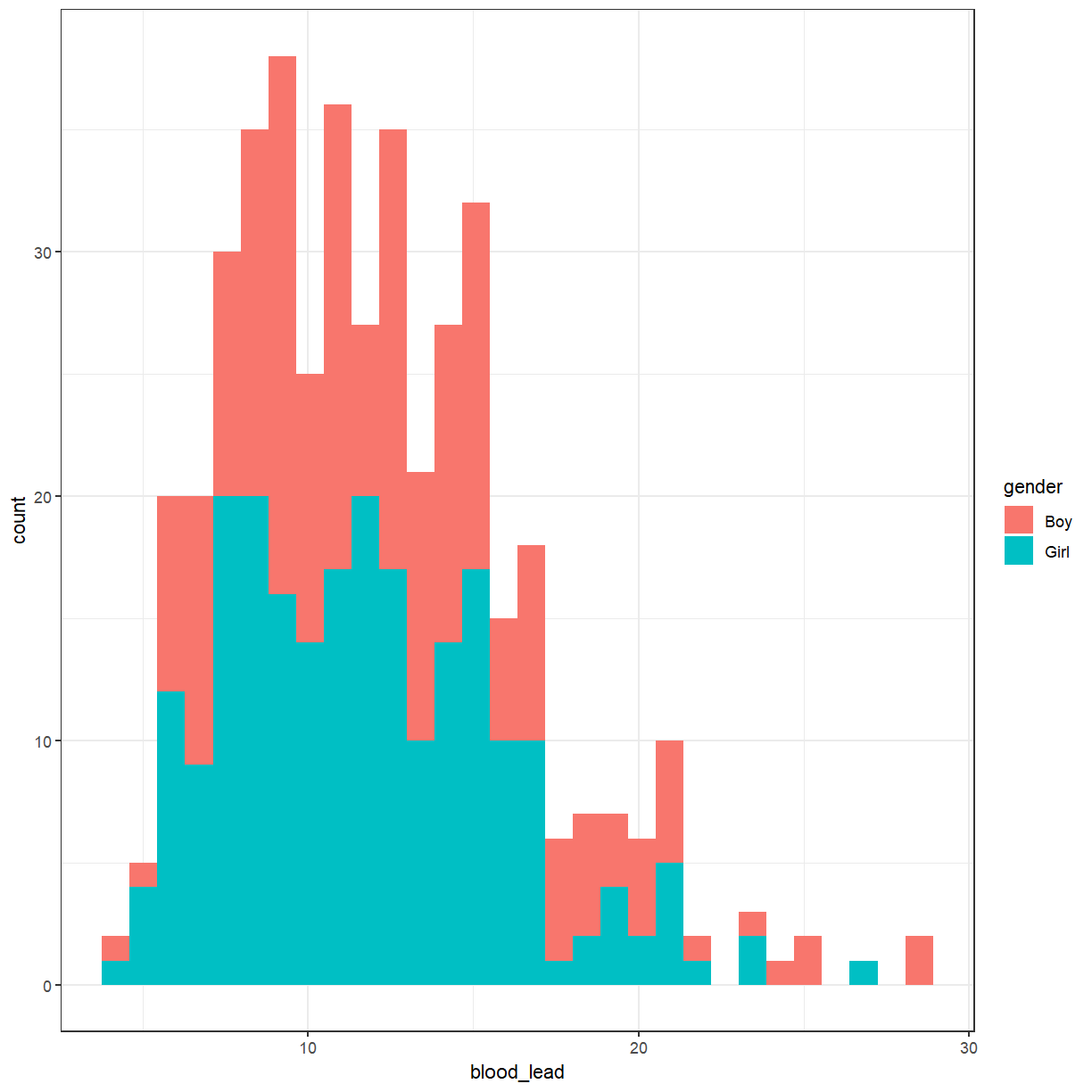
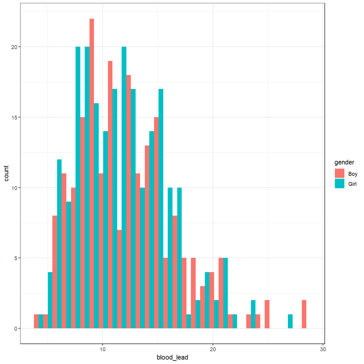
That produced a stacked histogram, which isn’t all that easy to read. It might be better if they were side-by-side.
ggplot(pattani, aes(x = blood_lead, fill = gender)) +
  geom_histogram(position = "dodge")
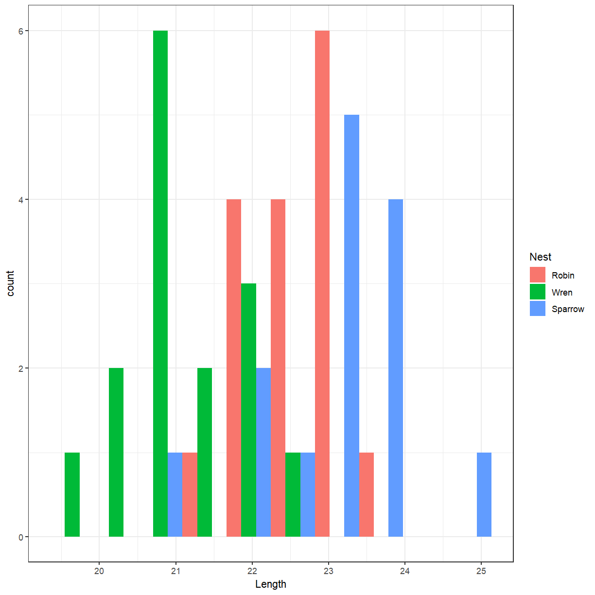
Cuckoo egg lengths by host nest
Create a histogram of the cuckoo egg lengths with colours showing the host nest species.
Solution
ggplot(cuckoo, aes(x = Length, fill = Nest)) +
  geom_histogram(position = "dodge", bins = 10)
There doesn’t seem to be much difference. Perhaps we should try a box plot. Notice that
gender is now the x variable and blood_lead is the y variable.
ggplot(pattani, aes(x = gender, y = blood_lead)) +
  geom_boxplot()
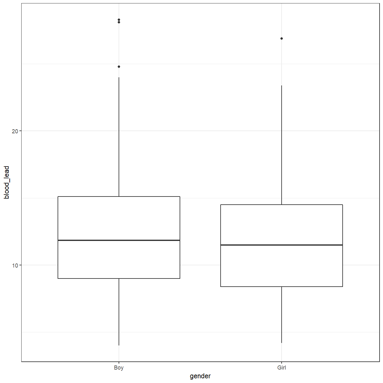
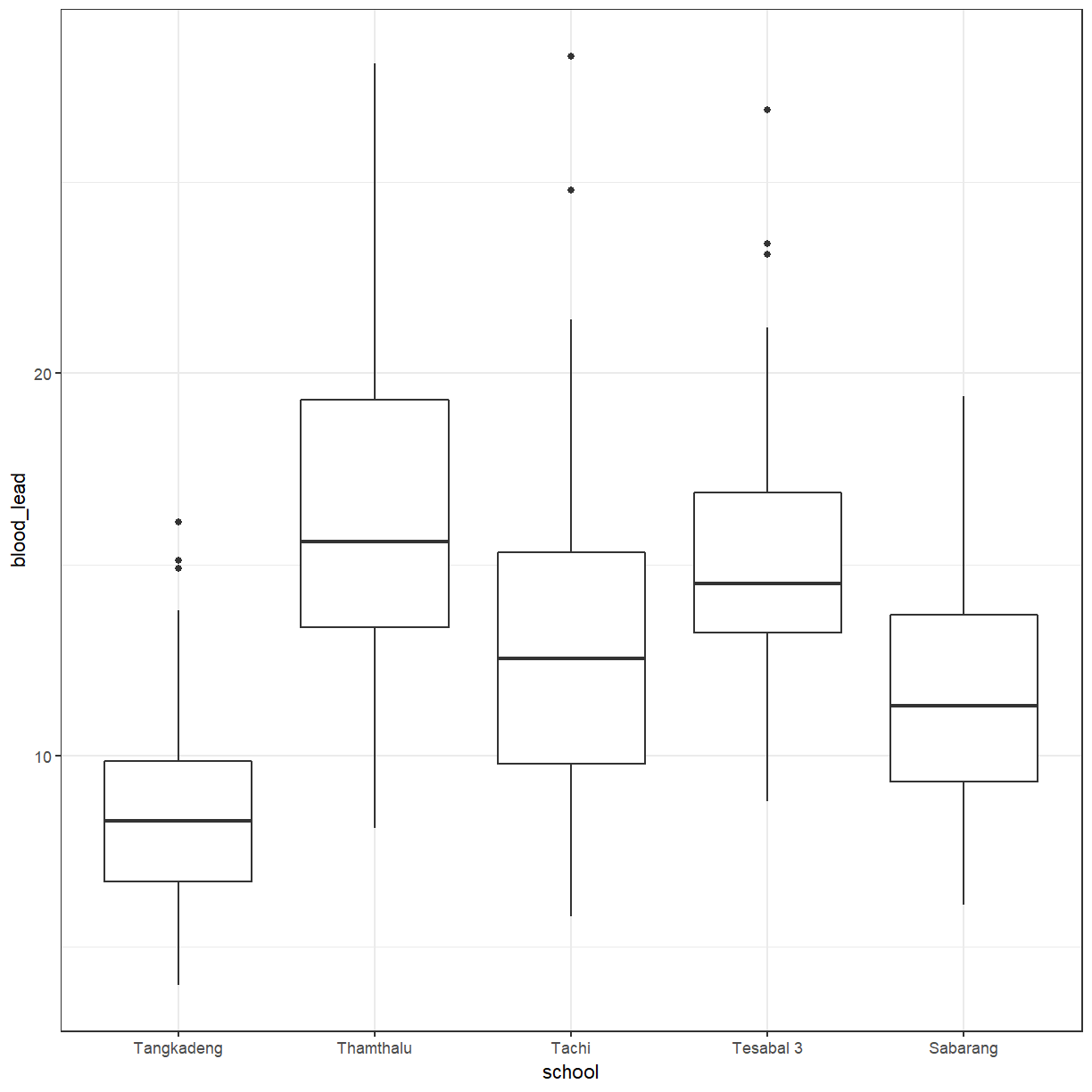
The box plot also suggests that there isn’t much difference between boys and girls. What about between schools?
ggplot(pattani, aes(x = school, y = blood_lead)) +
  geom_boxplot()
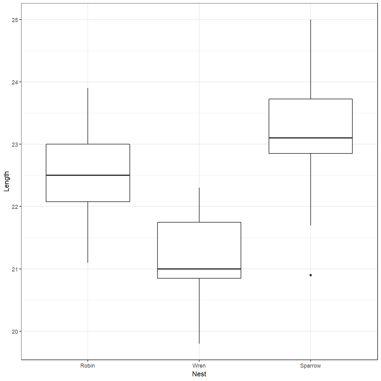
Box plot of cuckoo egg lengths by host nest
Create a box plot of the cuckoo egg lengths with colours showing the host nest species.
Solution
ggplot(cuckoo, aes(x = Nest, y = Length)) +
  geom_boxplot()
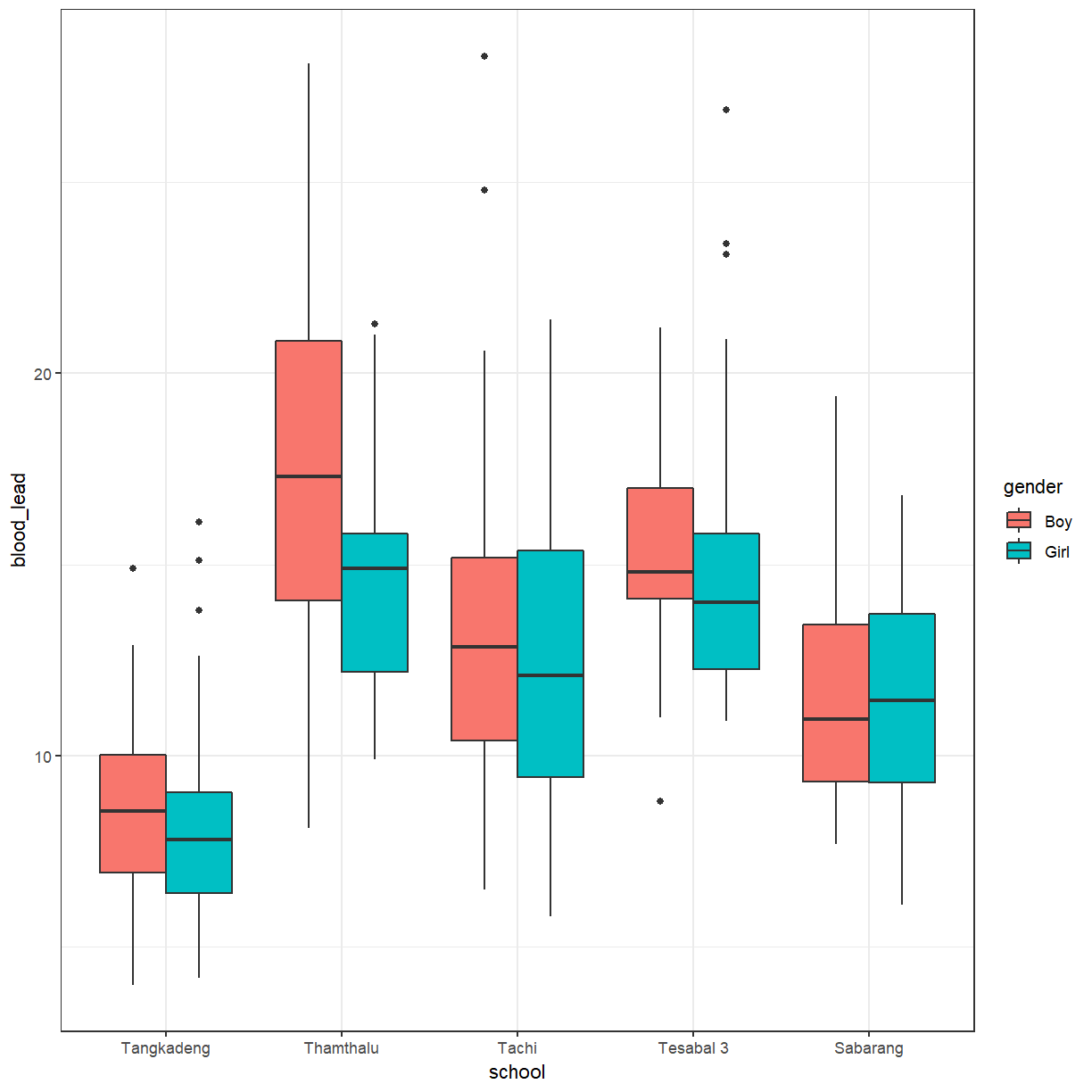
There does seems to be more difference between schools than between genders. We can add
gender back in again. Again, we have to use position = "dodge".
ggplot(pattani, aes(x = school, y = blood_lead, fill = gender)) +
  geom_boxplot(position = "dodge")
You can add a little bit of space between the boxes.
ggplot(pattani, aes(x = school, y = blood_lead, fill = gender)) +
  geom_boxplot(position = position_dodge(1))

Key Points
Data should have 1 observation per row.
