Visualising continuous data with ggplot2
Overview
Teaching: 60 min
Exercises: 30 minQuestions
What are the components of a ggplot?
How do I create histograms, density plots, and scatterplots?
How can I change the aesthetics (ex. colour, transparency) of my plot?
Objectives
Produce histograms, density plots and scatterplots using ggplot.
Set universal plot settings.
We start by loading the required package. ggplot2 is also included in the
tidyverse package.
library(tidyverse)
The data is available as part of the project you cloned from GitHub during the previous lesson. Switch to that project now if you haven’t opened it in RStudio already.
interviews_plotting <- read_csv("data_output/interviews_plotting.csv")
Parsed with column specification:
cols(
  .default = col_logical(),
  key_ID = col_integer(),
  village = col_character(),
  interview_date = col_datetime(format = ""),
  no_membrs = col_integer(),
  years_liv = col_integer(),
  respondent_wall_type = col_character(),
  rooms = col_integer(),
  memb_assoc = col_character(),
  affect_conflicts = col_character(),
  liv_count = col_integer(),
  items_owned = col_character(),
  no_meals = col_integer(),
  months_lack_food = col_character(),
  instanceID = col_character(),
  number_month_lack_food = col_integer(),
  number_items = col_integer()
)
See spec(...) for full column specifications.
Before we proceed to plot the data, let’s take a quick look at what we just loaded.
View(interviews_plotting)
Plotting with ggplot2
ggplot2 is a plotting package that makes it simple to create complex plots
from data stored in a data frame. It provides a programmatic interface for
specifying what variables to plot, how they are displayed, and general visual
properties. Therefore, we only need minimal changes if the underlying data
change or if we decide to change from a bar plot to a scatterplot. This helps in
creating publication quality plots with minimal amounts of adjustments and
tweaking.
ggplot2 functions like data in the ‘long’ format, i.e., a column for every
dimension, and a row for every observation. Well-structured data will save you
lots of time when making figures with ggplot2
ggplot graphics are built step by step by adding new elements. Adding layers in this fashion allows for extensive flexibility and customization of plots.
To build a ggplot, we will use the following basic template that can be used for different types of plots:
ggplot(data = <DATA>, mapping = aes(<MAPPINGS>)) + <GEOM_FUNCTION>()
- use the
ggplot()function and bind the plot to a specific data frame using thedataargument
ggplot(data = interviews_plotting)
- define a mapping (using the aesthetic (
aes) function), by selecting the variables to be plotted and specifying how to present them in the graph, e.g. as x/y positions or characteristics such as size, shape, color, etc.
Exercise
We would like to inspect the data for a potential relationship between the number of people living in a household (
no_members) and the number of items owned by that household (number_items). What would be a good way to visualise these data?Solution
Since we are dealing with two continuous variables, a scatterplot seems like a good starting point. However, both of these variables only take a relatively small number of discrete values. Under these circumstances a scatterplot may be problematic. Let’s take a look.
ggplot(data = interviews_plotting, aes(x = no_membrs, y = number_items))
-
add ‘geoms’ – graphical representations of the data in the plot (points, lines, bars).
ggplot2offers many different geoms; we will use some common ones today, including: geom_point()for scatter plots, dot plots, etc.geom_boxplot()for, well, boxplots!geom_line()for trend lines, time series, etc.
To add a geom to the plot use the + operator. To create a scatterplot we
want the data to be represented as points, which can be achieved with geom_point():
ggplot(data = interviews_plotting, aes(x = no_membrs, y = number_items)) +
    geom_point()
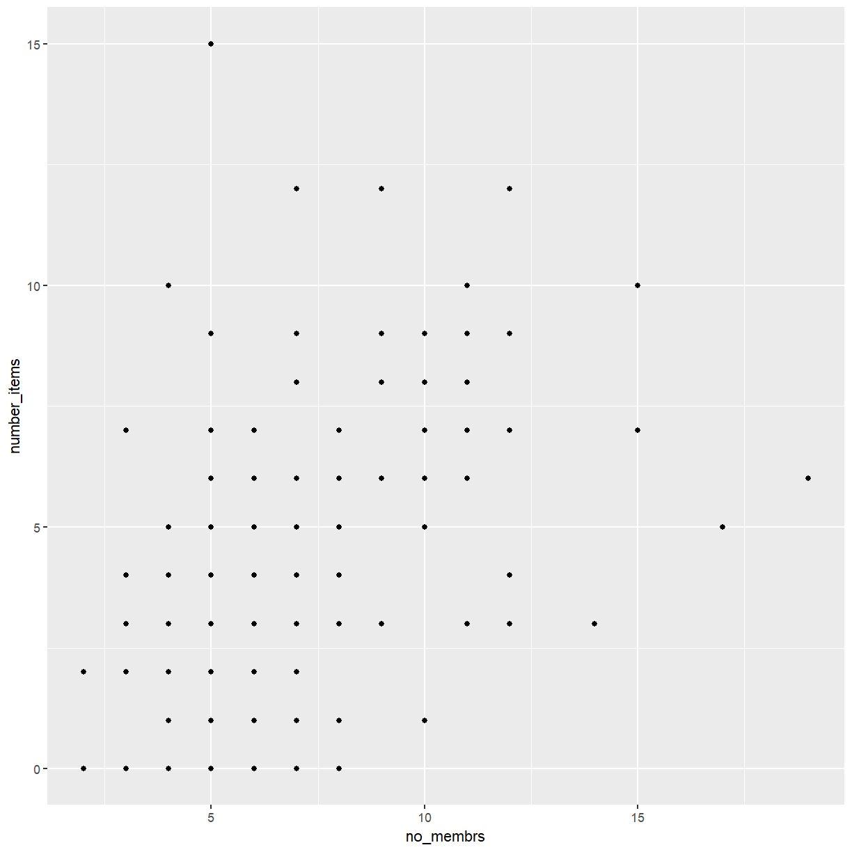
The + in the ggplot2 package is particularly useful because it allows
you to modify existing ggplot objects. This means you can easily set up plot
templates and conveniently explore different types of plots, so the above plot
can also be generated with code like this:
# Assign plot to a variable
interviews_plot <- ggplot(data = interviews_plotting, aes(x = no_membrs, y = number_items))

# Draw the plot
interviews_plot +
    geom_point()
Notes
- Anything you put in the
ggplot()function can be seen by any geom layers that you add (i.e., these are universal plot settings). This includes the x- and y-axis mapping you set up inaes().- You can also specify mappings for a given geom independently of the mapping defined globally in the
ggplot()function.- The
+sign used to add new layers must be placed at the end of the line containing the previous layer. If, instead, the+sign is added at the beginning of the line containing the new layer,ggplot2will not add the new layer and will return an error message.
## This is the correct syntax for adding layers
interviews_plot +
    geom_point()

## This will not add the new layer and will return an error message
interviews_plot
+ geom_point()
Building your plots iteratively
Building plots with ggplot2 is typically an iterative process. We start by
defining the dataset we’ll use, lay out the axes, and choose a geom:
ggplot(data = interviews_plotting, aes(x = no_membrs, y = number_items)) +
    geom_point()

Then, we start modifying this plot to extract more information from it.
Exercise
Because many households share the same values for size and number of items a lot of points in our plot end up on top of each other. That makes it hard to see how common a given combination is. How could we modify the plot to avoid this problem?
Solution
There are several options, including switching to a different type of plot entirely. For now, let’s strick with a scatterplot. We could improve the plot by adding transparency to the points. Another option is to add a small amount of jitter to each point. Together these will avoid most of the overplotting and make it possible to see overlapping points when it does happen.
We can add transparency using the alpha option:
ggplot(data = interviews_plotting, aes(x = no_membrs, y = number_items)) +
    geom_point(alpha = 0.5)

Note
When setting a mapping to a constant (e.g.
alpha = 0.5above) these can be set directly, without requiring a call toaes().
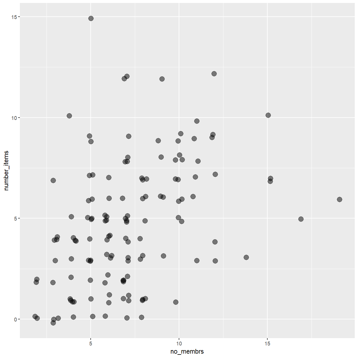
That only helped a little bit with the overplotting problem. We can also
introduce a little bit of randomness into the position of our points
using the geom_jitter() function.
ggplot(data = interviews_plotting, aes(x = no_membrs, y = number_items)) +
    geom_jitter(alpha = 0.5)

That is a bit better but now the points with similar x and y values are a
bit difficult to distinguish. We can fix that by reducing the amount of horizontal
jitter using the width argument.
ggplot(data = interviews_plotting, aes(x = no_membrs, y = number_items)) +
    geom_jitter(alpha = 0.5, width = 0.15, height = 0.15)
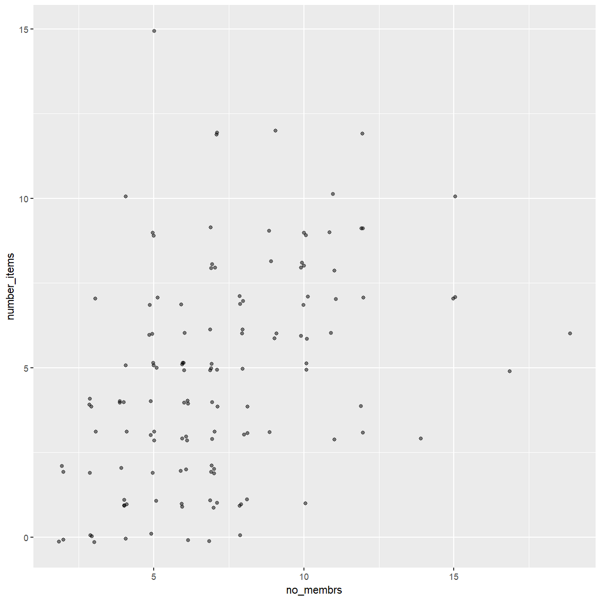
Now the points for each combination of no_membrs and number_items form small clusters
that can be distinguished visually.
After creating your plot, you can save it to a file in your favorite format. The Export tab in the Plot pane in RStudio will save your plots at low resolution, which will not be accepted by many journals and will not scale well for posters.
Instead, use the ggsave() function, which allows you easily change the dimension
and resolution of your plot by adjusting the appropriate arguments (width, height and dpi).
Make sure you have the fig_output/ folder in your working directory.
membrs_item_plot <- ggplot(data = interviews_plotting, aes(x = no_membrs, y = number_items)) +
    geom_jitter(alpha = 0.5, width = 0.15, height = 0.15)

ggsave("fig_output/membrs_item.png", membrs_item_plot, width = 15, height = 10)
Note
If you are using git to track changes to your script files, you can do the same for your plots. Try adding the file you just created to your git repository.
Exercise
It may be possible to enhance the appearance of the plot further by changing the size of the points. Use the
sizeargument to change the point size. Combine this with thewidthandheightarguments to adjust the jitter.Try a few different values. Which one do you like best?
Solution
Here is one possible solution.
ggplot(data = interviews_plotting, aes(x = no_membrs, y = number_items)) +
    geom_jitter(alpha = 0.5, width = 0.2, height = 0.2, size = 4)
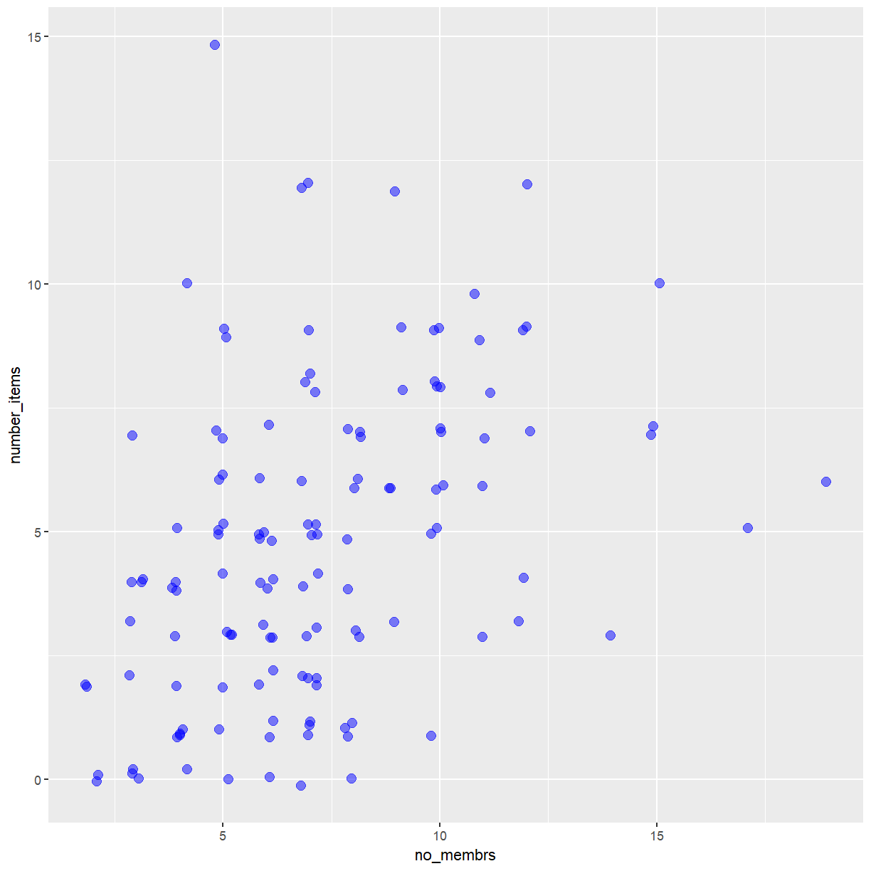
We can also add colors for all the points:
ggplot(data = interviews_plotting, aes(x = no_membrs, y = number_items)) +
geom_jitter(alpha = 0.5, width = 0.2, height = 0.2, size = 3, color = "blue")
Or to color each village in the plot differently, you could use a vector as an input to the argument color.
Because we are now mapping features of the data to a color, instead of setting one color for all points,
the color now needs to be set inside a call to the aes function. ggplot2 will provide a different color
corresponding to different values in the vector.
Here is an example where we color by village:
ggplot(data = interviews_plotting, aes(x = no_membrs, y = number_items)) +
    geom_jitter(aes(color = village), alpha = 0.5, width = 0.2, height = 0.2, size = 3)
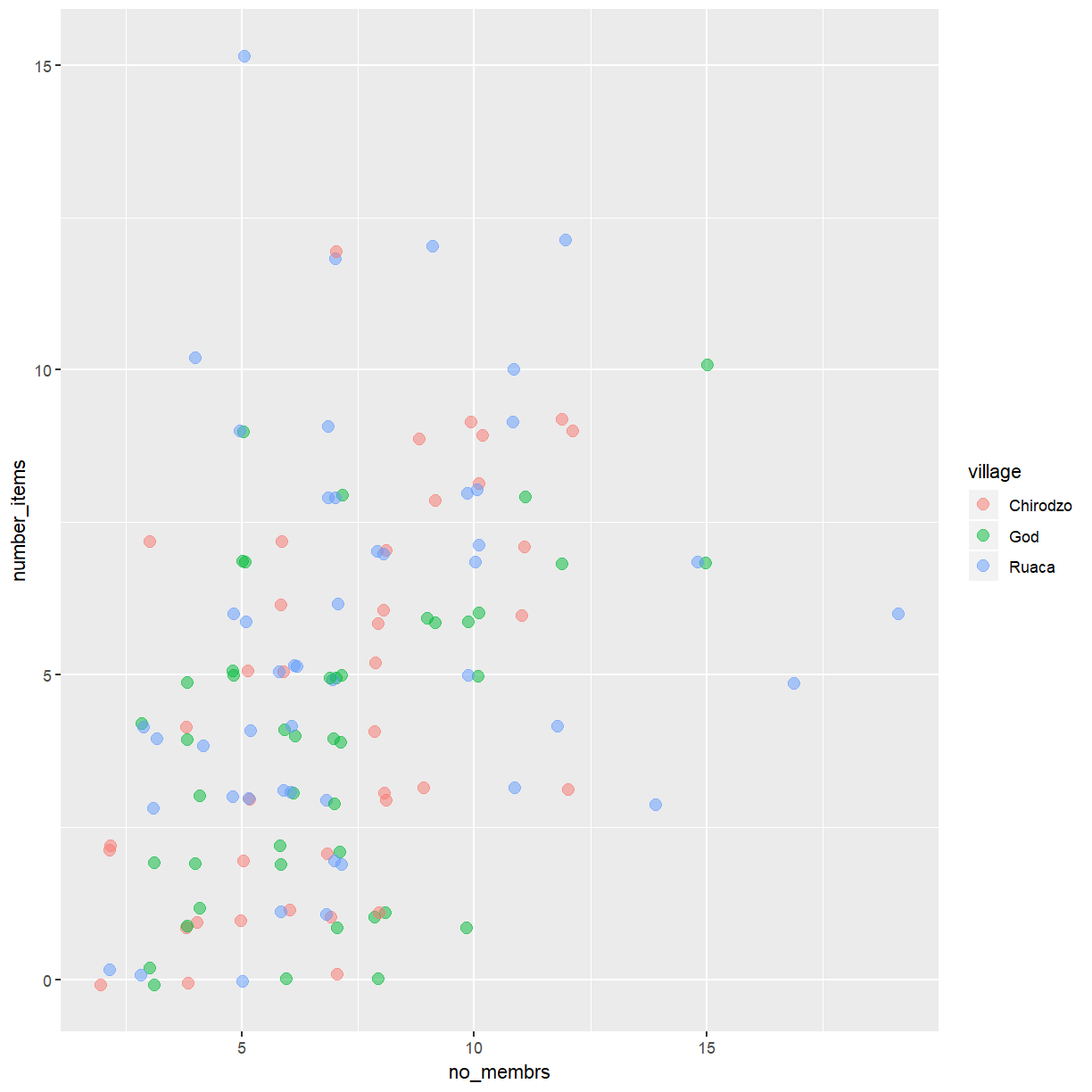
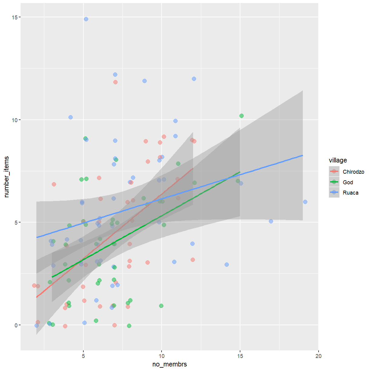
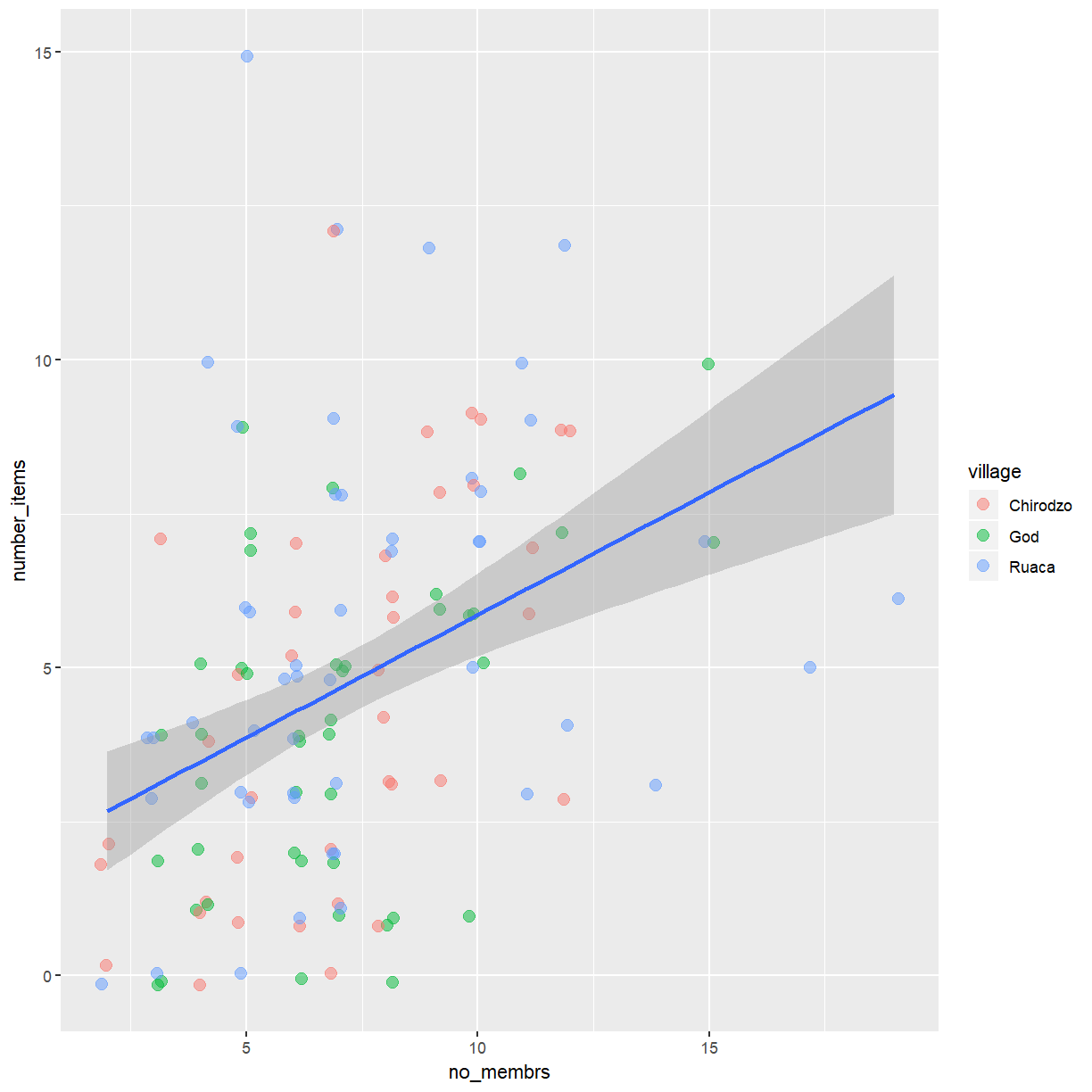
There appears to be a positive trend between number of household members and number of items owned (from the list provided). This trend does not appear to be different by village.
You can highlight this aspect of the data by adding a regression line
to the plot. The function geom_smooth allows you to add a a variety
of different smoothing functions to the plot. You can choose the type
of smoother to use by setting the method argument. Use method='lm'
to get a regression line.
ggplot(data = interviews_plotting, aes(x = no_membrs, y = number_items)) +
    geom_jitter(aes(color = village), alpha = 0.5, width = 0.2, height = 0.2, size = 3) +
    geom_smooth(method='lm')
Exercise
Add separate regression lines for each village.
Hint: Asking ggplot to map
villageto an aesthetic when drawing the regression lines will produce one line per village.Solution
ggplot(data = interviews_plotting, aes(x = no_membrs, y = number_items)) +
    geom_jitter(aes(color = village), alpha = 0.5, width = 0.2, height = 0.2, size = 3) +
    geom_smooth(aes(color = village), method='lm')
This will be the last version of this plot you look at today. That seems like a good time to save the product of your work.
membrs_item_plot <- ggplot(data = interviews_plotting, aes(x = no_membrs, y = number_items)) +
    geom_jitter(aes(color = village), alpha = 0.5, width = 0.2, height = 0.2, size = 3) +
    geom_smooth(aes(color = village), method='lm')

ggsave("fig_output/membrs_item.png", membrs_item_plot, width = 15, height = 10)
Exercise
Commit this revised version of the plot to git and push your changes to your GitHub repository.
Go to GitHub and find the your last commit. Examine the differences between the versions of your plot in the diff viewer.
Exercise
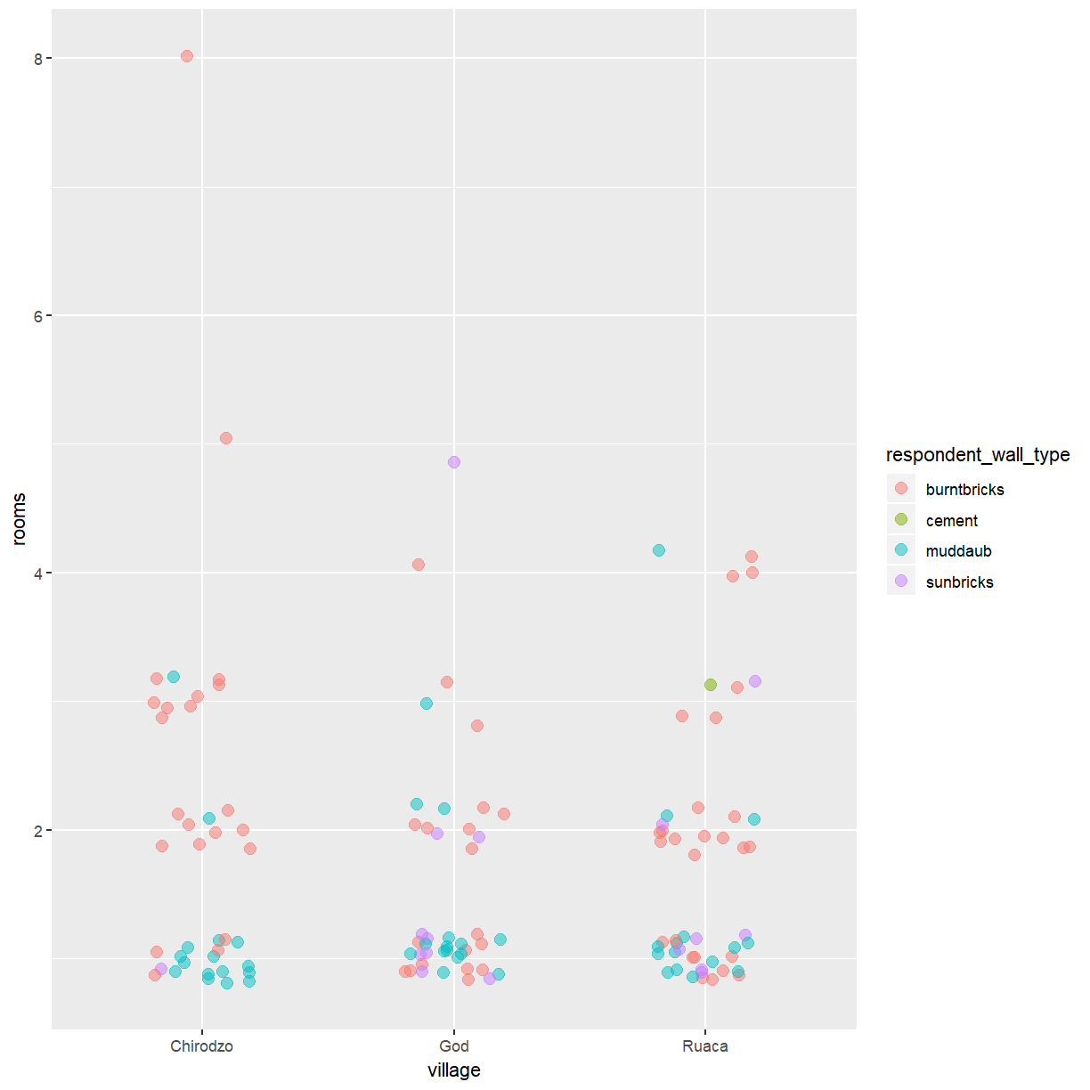
Use what you just learned to create a scatter plot of
roomsbyvillagewith therespondent_wall_typeshowing in different colors. Is this a good way to show this type of data?Solution
ggplot(data = interviews_plotting, aes(x = village, y = rooms)) +
    geom_jitter(aes(color = respondent_wall_type), alpha = 0.5, width = 0.2, height = 0.2, size = 3)
Histograms and density plots
While scatterplots are useful when exploring the relationship between two continuous variables, you may be interested in visualising the distribution of a single variable. Two plot types commonly used for this purpose are histograms and density plots.
You can create histograms with ggplot using geom_histogram(). Let’s take a look
at the distribution of household size (no_membrs).
ggplot(data = interviews_plotting, aes(x = no_membrs)) +
    geom_histogram()
`stat_bin()` using `bins = 30`. Pick better value with `binwidth`.
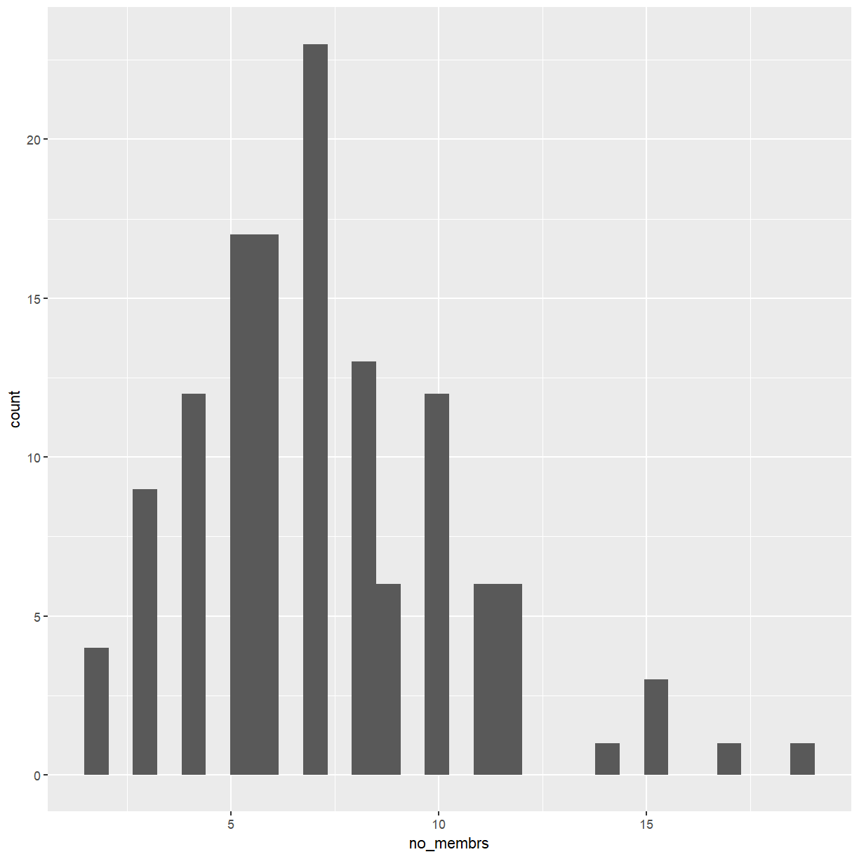
That doesn’t look great. Histograms count the number of observations in a series of bins that cover the range of the data. When creating histograms you have to be mindful of the effect the chosen bins have on the appearance of the plot. The most important rule to keep in mind is that bins should always be of equal size. But even then the choice of break points can make a big difference. Since you know that there won’t be any fractional household members it makes sense to set the bin width to 1.
ggplot(data = interviews_plotting, aes(x = no_membrs)) +
    geom_histogram(binwidth=1)
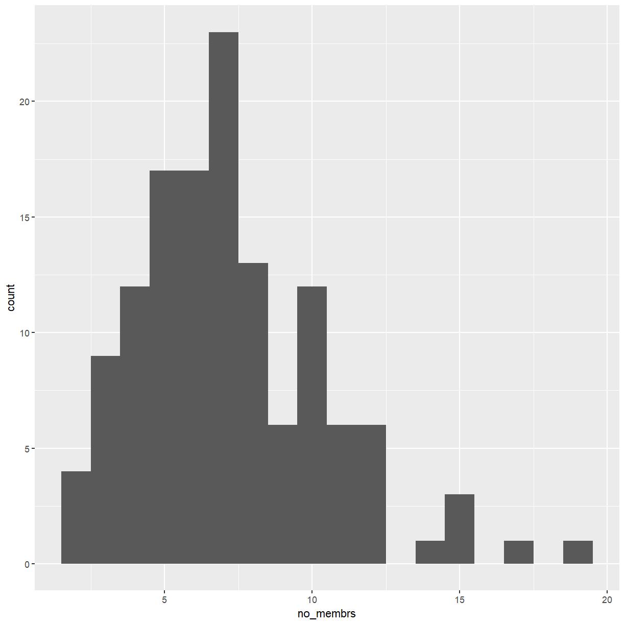
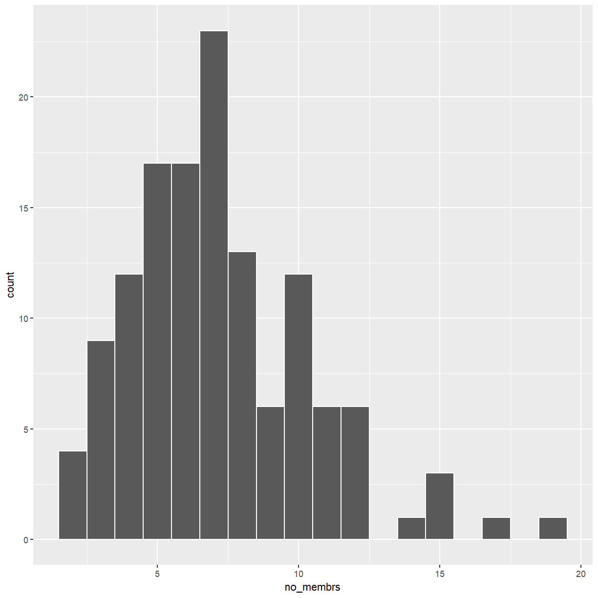
That’s a bit better but it is difficult to distinguish adjacent bars of the same hight.
That is easily fixed by setting color = "white".
ggplot(data = interviews_plotting, aes(x = no_membrs)) +
    geom_histogram(binwidth=1, color="white")
Exercise
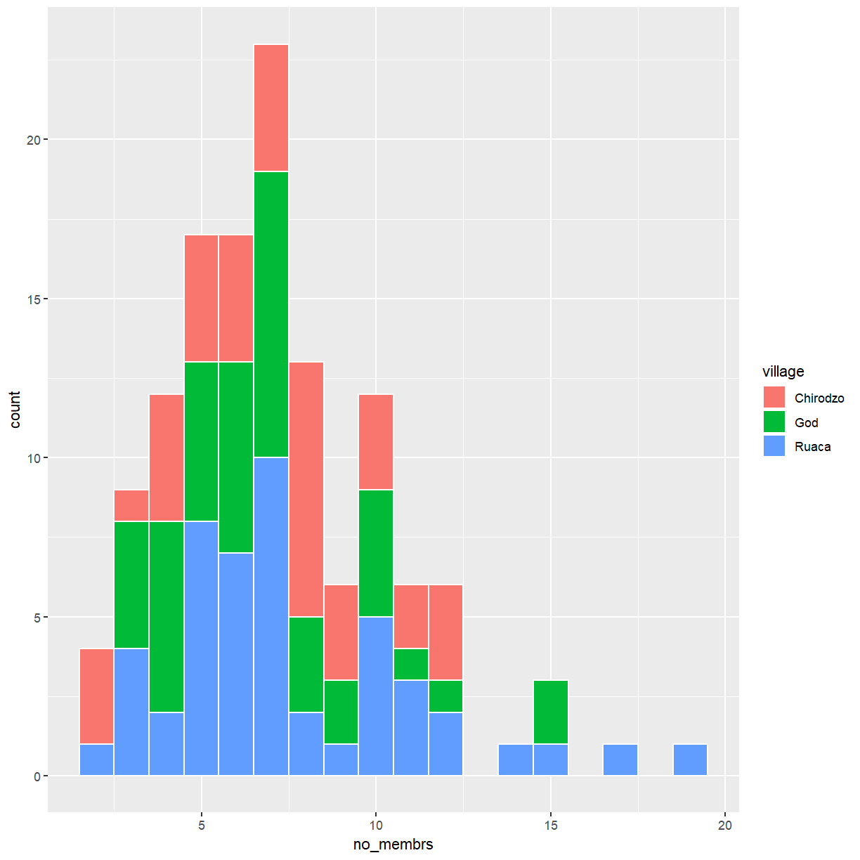
It might be more interesting to look at household size by village. Create a plot with separate histograms for each village.
Hint: Use
fillto get different colored bars.Solution
ggplot(data = interviews_plotting, aes(x = no_membrs, fill = village)) +
    geom_histogram(binwidth=1, color="white")
Is this a good plot? How could it be improved?
Stacked histograms tend to be hard to read. One alternative
is the use of frequency polygons. To switch from histograms to frequency polygons
simply replace geom_histogram() with geom_freqpoly()
ggplot(data = interviews_plotting, aes(x = no_membrs, color = village)) +
    geom_freqpoly(binwidth=1)
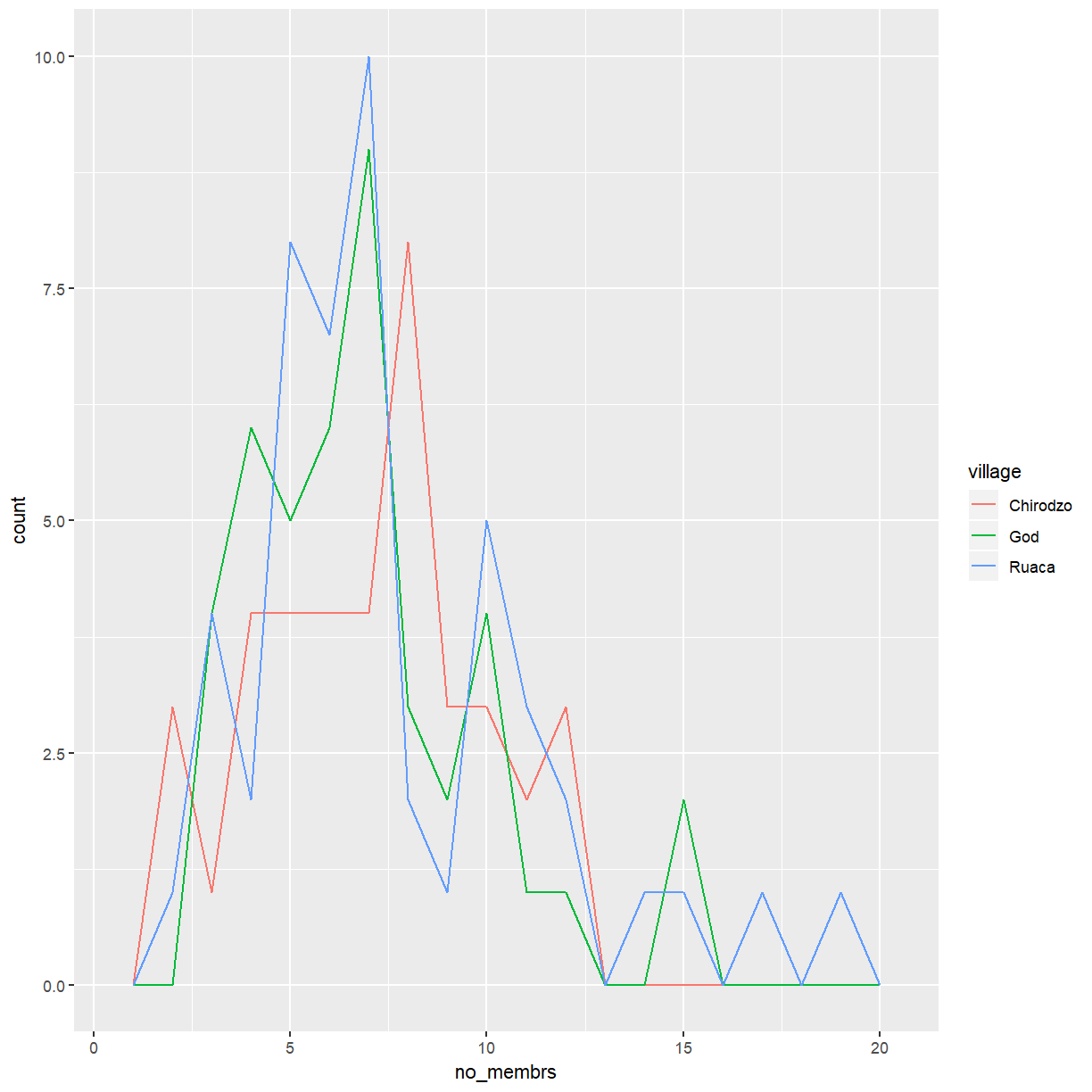
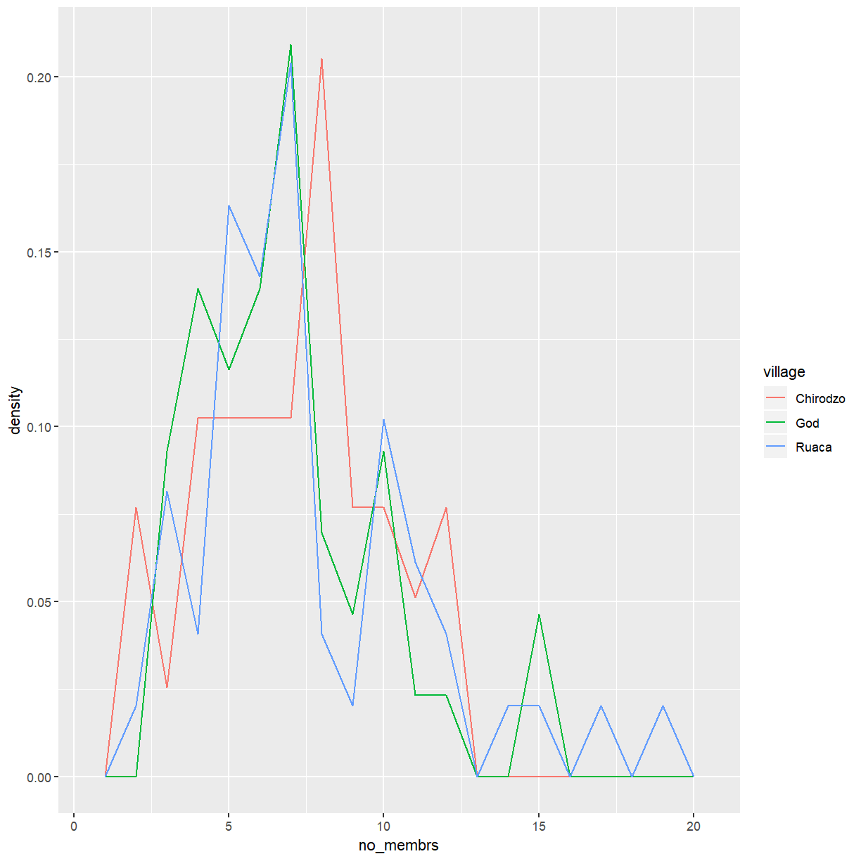
Since the number of responses may differ between villages it can be problematic
to compare absolute counts like this. Instead, it is better to look at densities.
You can create the same plot as above for densities by using stat(density).
ggplot(data = interviews_plotting, aes(x = no_membrs, y = stat(density), color = village)) +
    geom_freqpoly(binwidth=1)
You can achieve a similar effect with density plots, using geom_density().
ggplot(data = interviews_plotting, aes(x = no_membrs, color = village)) +
    geom_density()
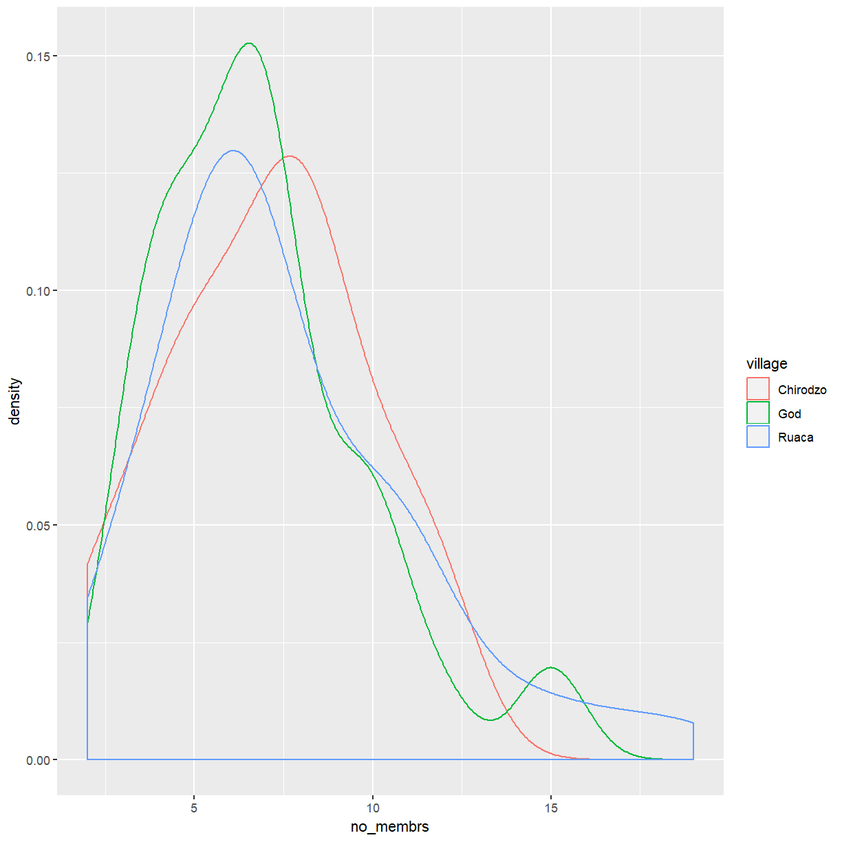
This provides a smoothed density estimate that is generally more appropriate for data that are less discrete.
Key Points
ggplot2is a flexible and useful tool for creating plots in R.The data set and coordinate system can be defined using the
ggplotfunction.Additional layers, including geoms, are added using the
+operator.Histograms and density plots are useful tools to visualise the distribution a a continuous variable.
Scatterplots can be useful in understanding the relationship between two continuous variables.
